BITE, Best breakfast in Jersey — made fresh, made halal, made for you.
Client:
Year:
Role:
Taking the best breakfast in Jersey from word of mouth to word on the street.
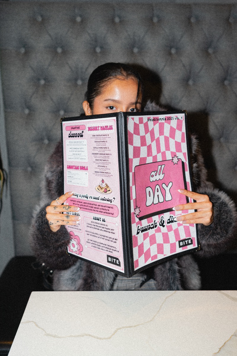
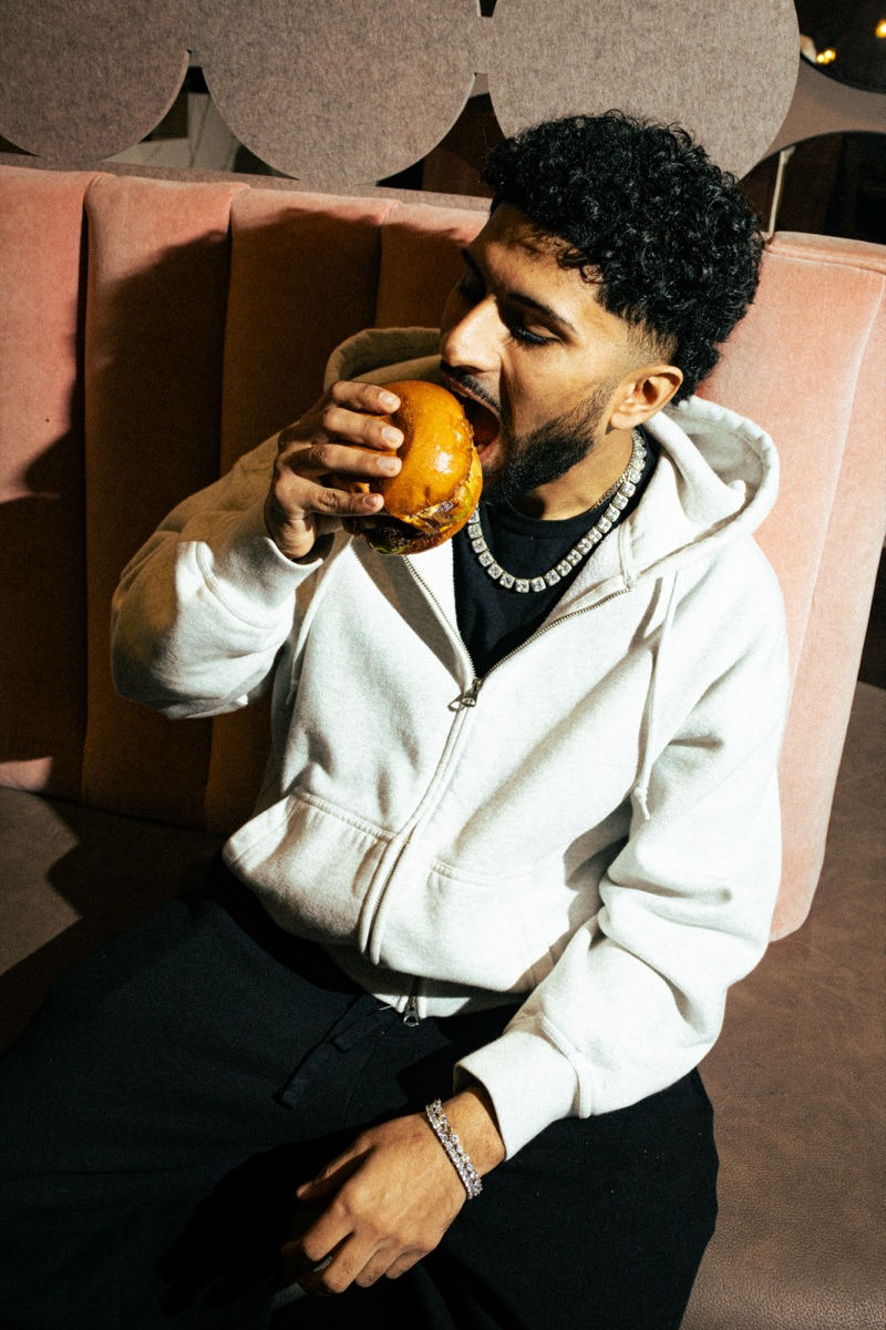
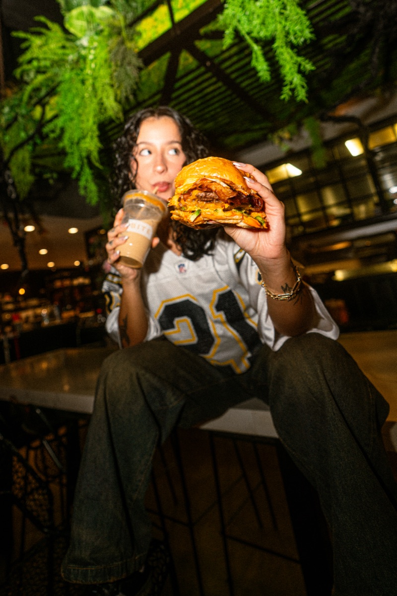
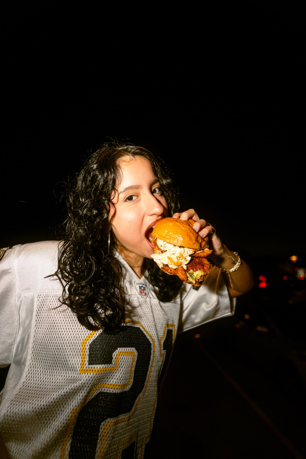
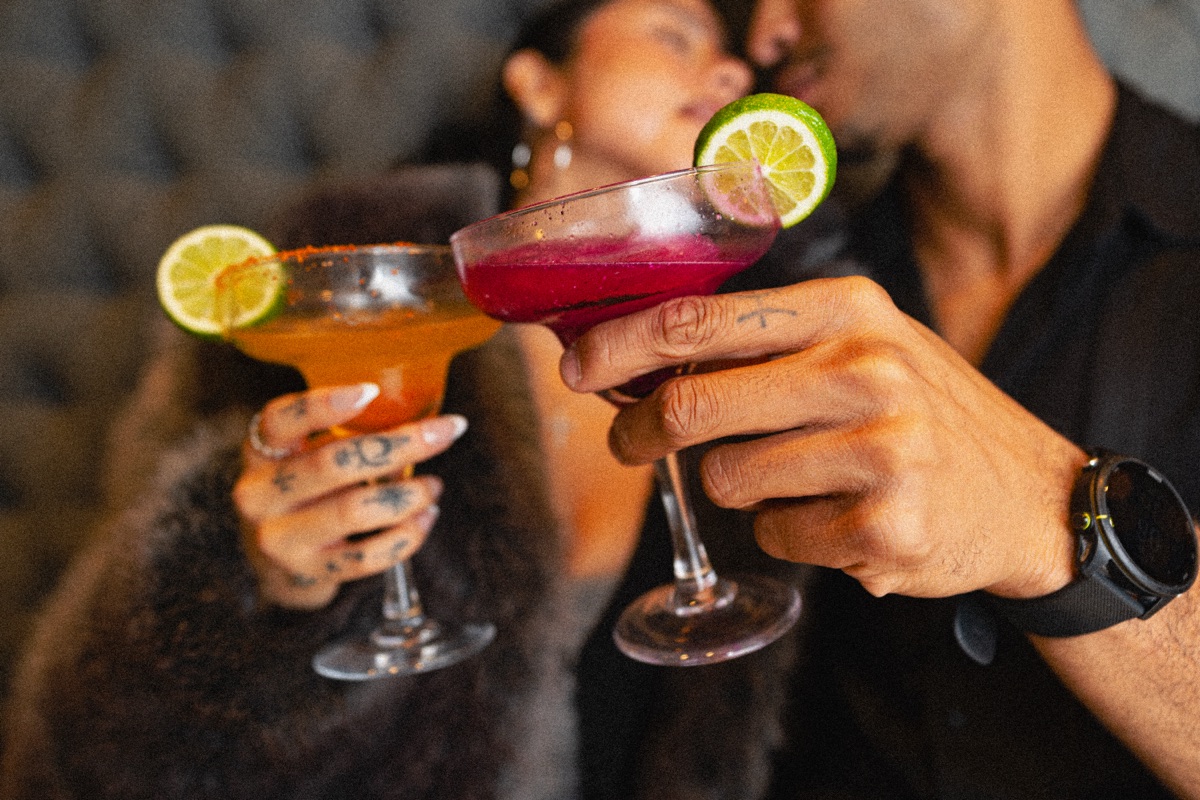
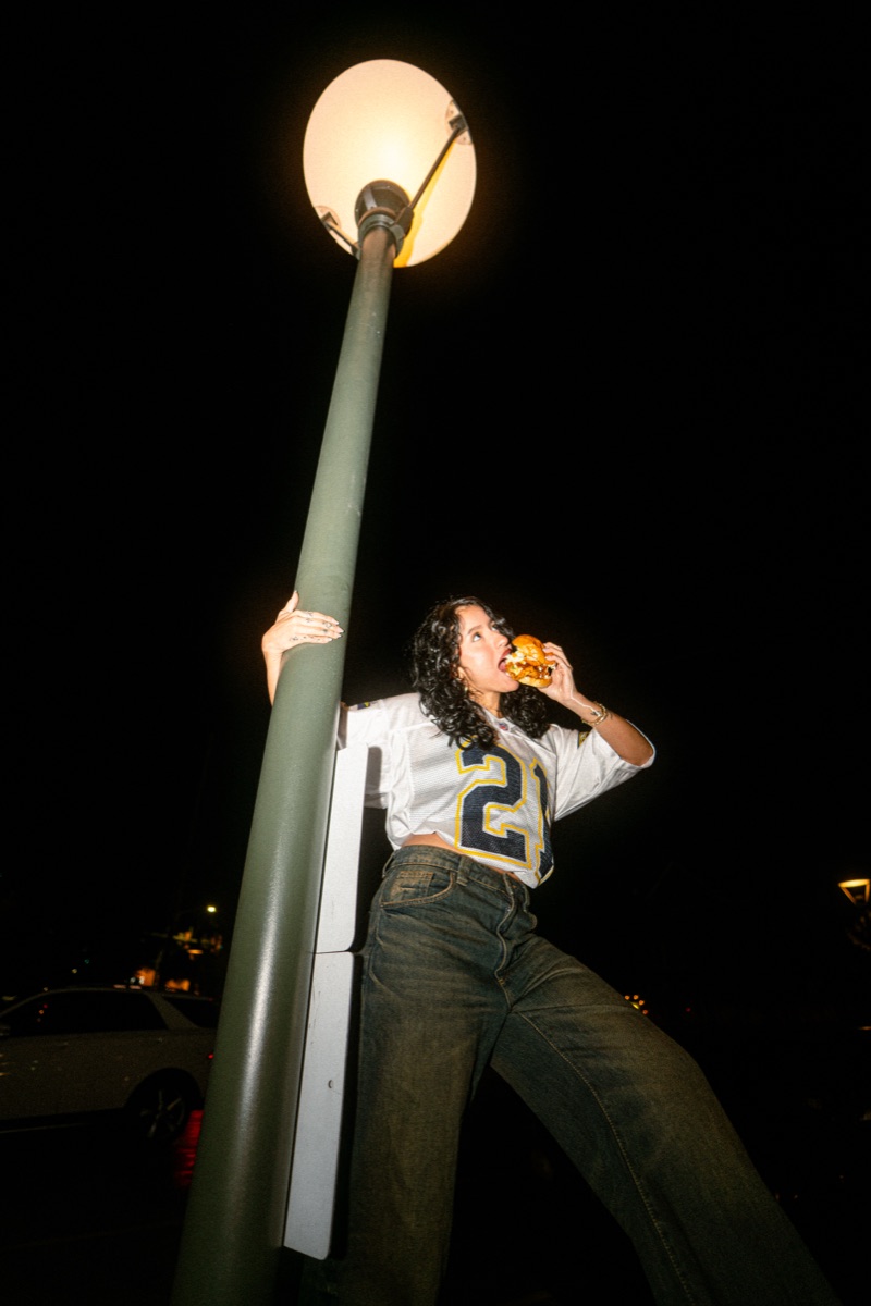
Regulars never needed convincing — strangers needed a signal. Every touchpoint now leads with what the line outside already knows: fresh, halal, and worth the wait.
An identity that reads from a moving car and holds up on a coffee cup.
The Palette
BITE — Brand ColorsProject description
BITE is a halal brunch, dinner and coffee house in New Jersey with a kitchen people line up for. We partnered with the team to give the brand the same confidence as the food — a full identity, art direction and menu system, carried through to a new website and the feed.
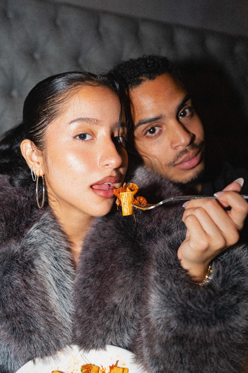
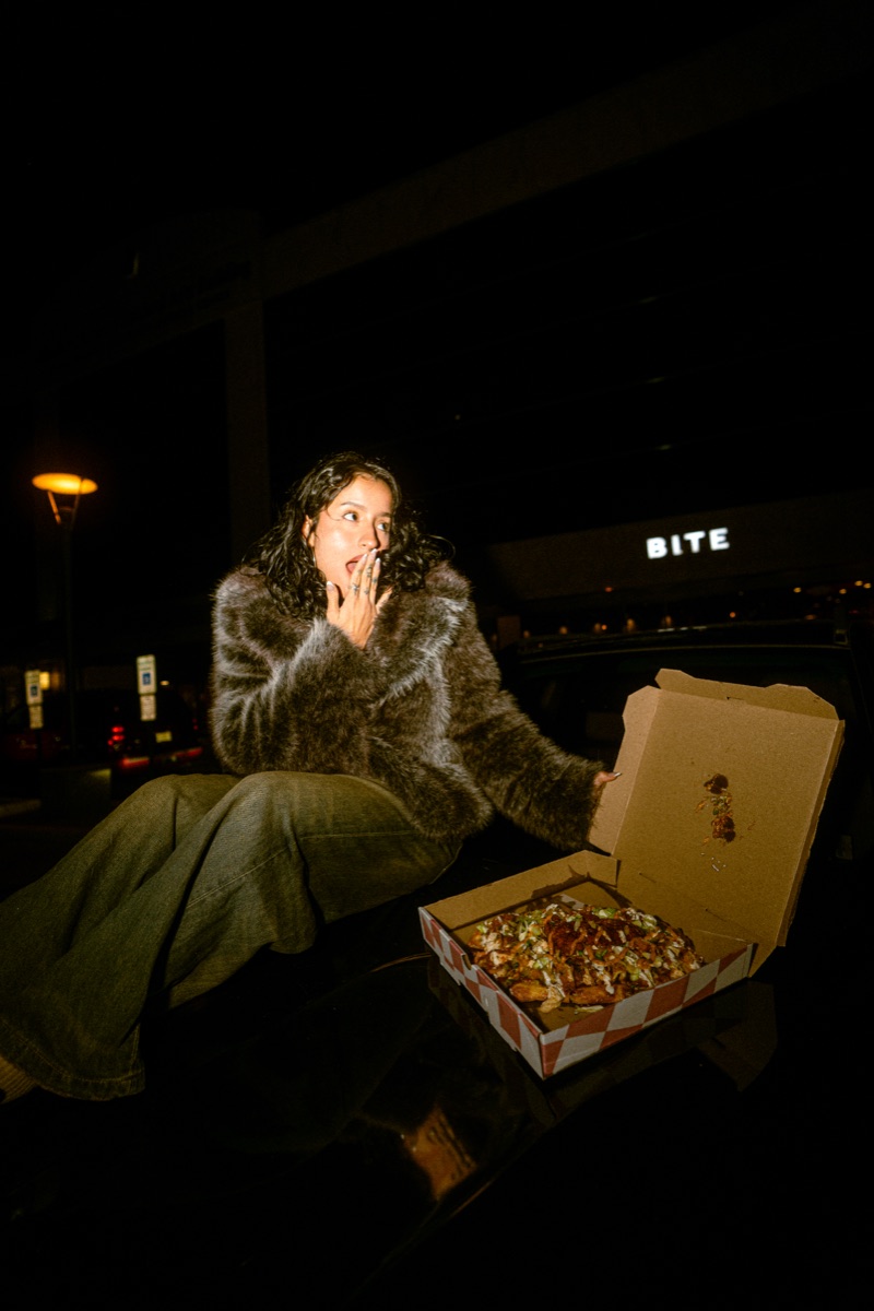
The work covers the wordmark, palette and voice; photography direction for the dishes and the people who love them; and a modular menu structure built to absorb new specials without ever needing a redesign.
Credits
- ClientBITE — New Jersey
- Creative DirectionArchive Studios
- Brand IdentityArchive Studios
- PhotographyArchive Studios
- Web Design & BuildArchive Studios
- Year2026